
EskomSePush is an app that monitors the national loadshedding (blackouts) status across South Africa and sends push notifications when you will be affected by loadshedding.
The app has some really useful features like count down timers until loadshedding starts in your area and also shares the loadshedding data (you can access it here).
While basic charts like bar graphs are useful to see the increase over time, they don’t show severity of the blackouts.
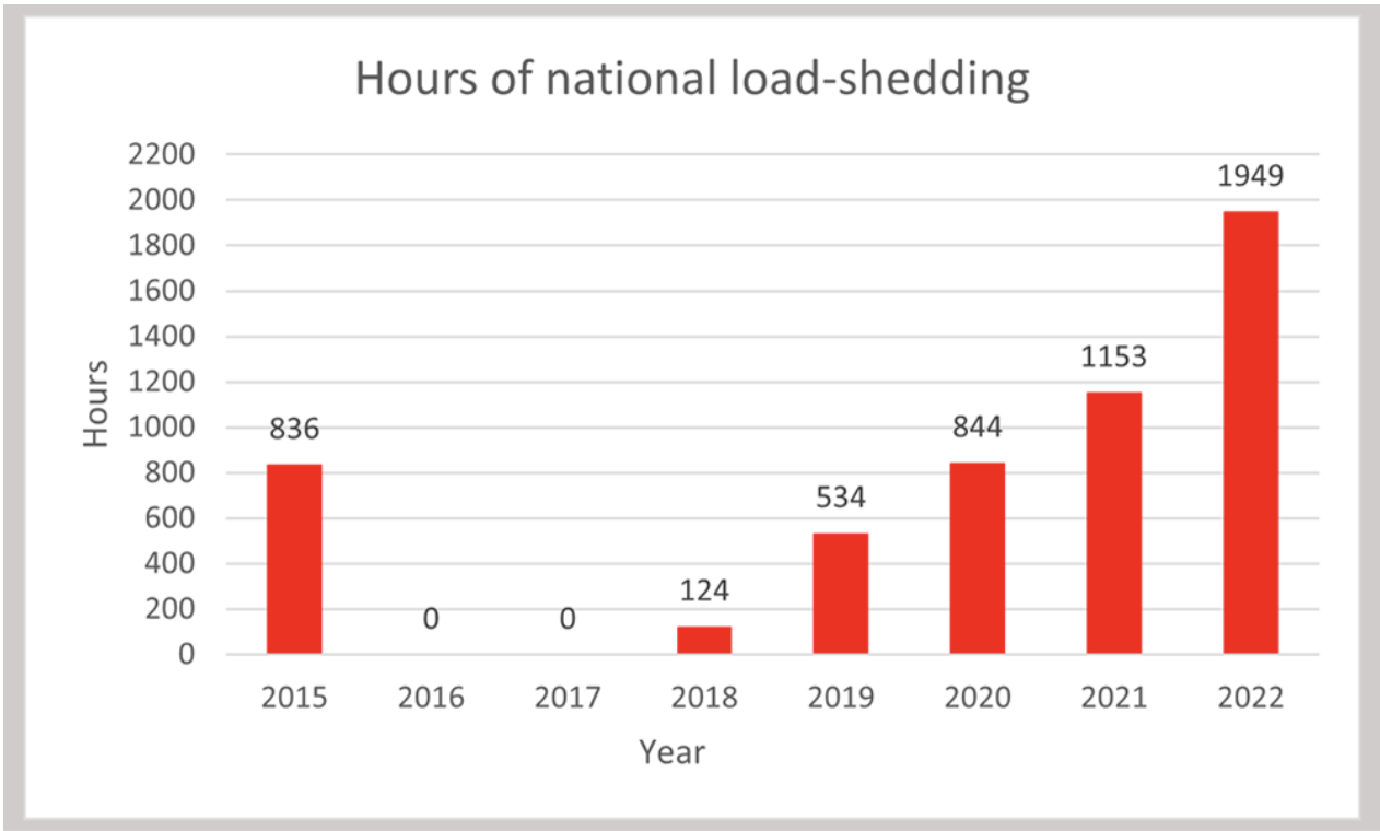
(1949 hours of loadshedding is a lot, considering there are only 8760 hours in a year).
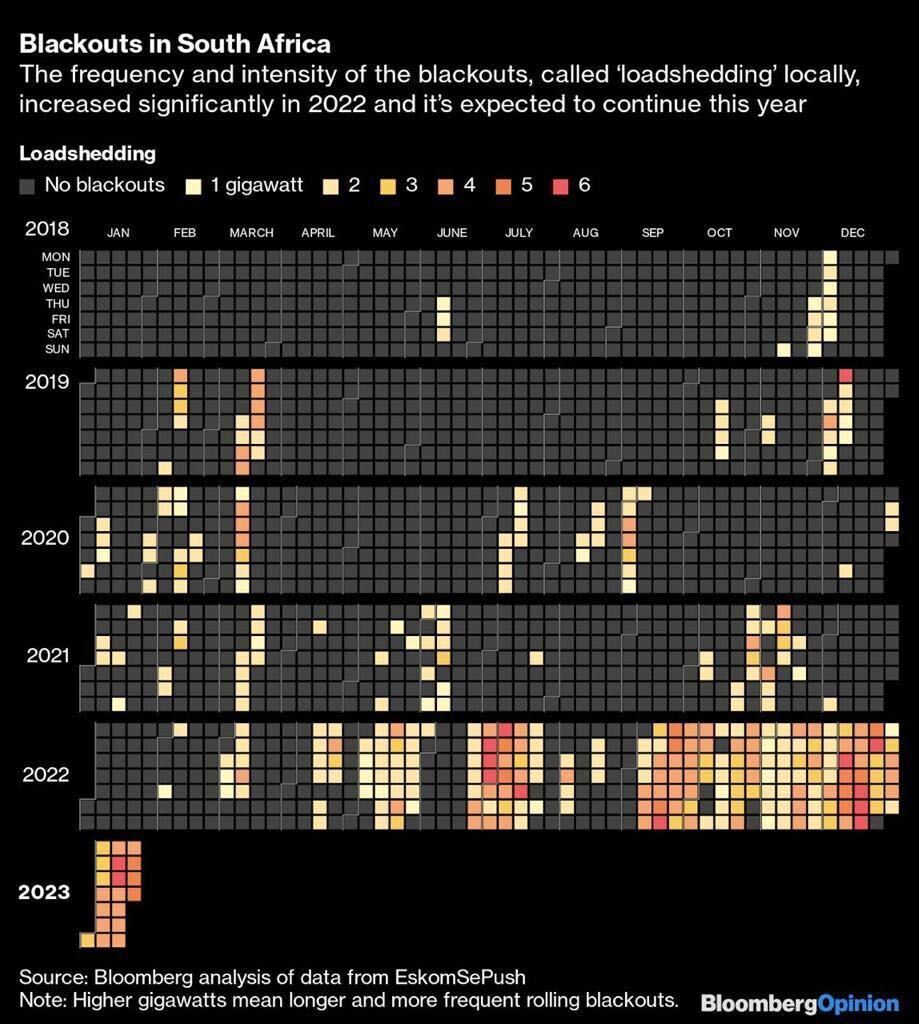
I came across this chart a few days ago by Bloomberg using the EskomSePush data. It provides a simple but powerful calendar view showing days affected and severity of loadshedding on those days.
https://www.bloomberg.com/opinion/articles/2023-01-23/desperate-to-be-a-ceo-here-s-the-worst-job-in-global-energy?srnd=premium-uk
Do you experience blackouts in your country?
Have you tried visualising any energy-related data?