
Chart of the Week: Interpreting Log Charts
Connect · 19 Apr 2023, 09:56 · 0
The logarithmic, also known as “log” scale is often used when analyzing large range quantities such as sales of a product or decay of a radioactive element. The log scale however can be challenging to interpret and for many, not quite intuitive.
This week we’re looking at charts depicting populations from different regions of the world and in particular, we’ll use the log scale to help us understand how these populations change over time. The data used was acquired from the World Bank.
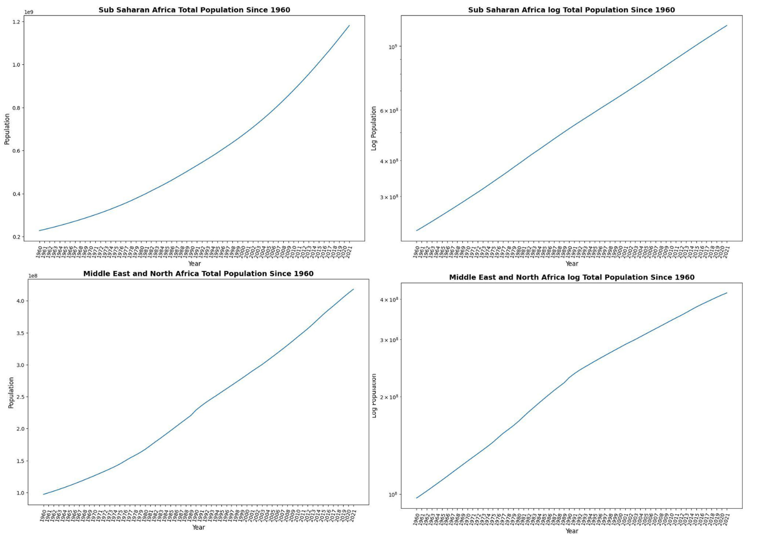
Is the population in the MENA region increasing or falling?
- Do you think the population is changing at a faster rate in SSA compared to MENA?
- What conclusions can you draw from the log of total population in SSA?
- Do you know of any other useful applications of the log scale?
Discussion 0 answers