
Chart of the week: Pie Charts are Evil!
Connect · 26 Oct 2022, 09:18 · 2
Pie charts are fun to look at but they are often misused, this week we are looking at when to use a pie chart and when not to.
A pie chart shows us how a part is relative to the whole. When you hear “percent of…” or “part of…” that’s one indication a pie chart could meet your needs.
There are two primary use cases for a pie chart:
- If you want your audience to have a general sense of the part-to-whole relationship in your data and comparing the precise sizes of the slices is less important.
- To convey that one segment of the total is relatively small or large.

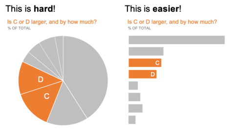
Here are some examples when you should choose a different chart.
In a pie chart it is difficult to determine if C or D is large but a bar chart the difference is more pronounced.
To read more about pie charts on Story Telling With Data.
- Where are instances where you have seen a pie chart that didn’t make sense?
- What would you have used instead?
- Have you used a pie chart when another chart would have been better? If you have please share your experience and what you learned.
Story Telling With Data is a great resource to discover different charting options and how to convey a story!
I think they are only useful when you have 2 categories. Anything more and they should be avoided. Unfortunately there are thousands and thousands of people in business who love them :-|
I think when plotted with percentage makes it very clearly displaying the data distribution easly